-
Architects: ZHUBO DESIGN
- Area: 168950 m²
- Year: 2012
-
Photographs:Courtesy of ZHUBO DESIGN


Text description provided by the architects. Named after its developer SHENYE TAIRAN Building stands at the focal point in CheGongMiao- industrial creative industry office district in Shenzhen, China. Balancing the duality of scales, the design achieves two primary goals- to deliver a prominent image at the urban level while remaining inviting at the local, human scale. To achieve that, Shenye Tairan departs from a typical office building typology.

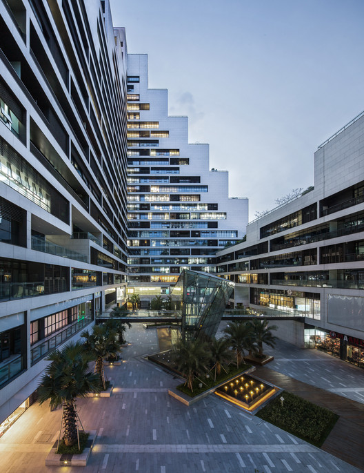
According to the required program area and the size of the site, the standard solution would have yielded two separate 100m office towers, set back from the street by a commercial podium. Instead this building is conceived as a continuous volume along the edge of the site as close as possible to the street. The the southwest corner is extruded to its maximum allowable height in order to capitalize on proximity to Binhe Road and Shenzhen Bay. The opposite NE corner is then scaled down and lifted up from the ground to invite pedestrians into the internal public spaces.


The result is a city block building with a vertical courtyard of treasures - a central communal space framed by tall mass of the building on two sides where one feels protected from both the urban bustle outside and shaded from the hot southern sun.
At the heart of the courtyard a reflecting pool frames a crystalline volume which serves as a light-filled central entrance to the underground parking. Rather than arriving into a dark parking garage and entering the building through an unassuming elevator core, it provides direct access through the interior courtyard, again modifying the typical experience of arriving and entering the office environment.

Typical office tower roof is removed from public realm. The roof of Tairan building is a series of accessible terraces forming the 5th facade of the building. These have been designed as a uniform landscape despite the fact that they are all privately owned and features lush gardens of curving benches, wood terraces and planting creating a unique sight from the surrounding office towers as well as from the office interior.


The facade of the building is composed of stacked elongated one floor level high units which play double function. First, the division enables to consider each office unit in singularity providing option to step the glazing back thus creating additional balcony-yet another unusual feature in a typical office layout. This "in between space" also acts as a shading device minimizing the cooling load. And finally it provides room for the individual air conditioning units without interrupting the main facade.

This duality is further expressed in the choice of materials. The outer layer composed of light stone is in focus catching and reflecting the rays of the sun. The inner balcony facade is lined with dark grey aluminum panels and remains in shadow hiding the 'contents' within.


